Are website footers a crucial part of a website's design? When it comes to creating a seamless user experience, the importance of a well-crafted footer cannot be overstated. As web designers and developers, we recognize the pivotal role that footers play in providing essential information and enhancing navigation.
But what are the best design practices for creating an effective and aesthetically pleasing footer? In this article, we will explore the significance of website footers, the essential elements they should contain, and showcase 15 top examples to inspire and inform.
So, what makes a footer truly exceptional? Join us as we unravel the key principles and innovative approaches to footer design, and discover how it can elevate the overall user experience.
Importance of Website Footers

The website footer significantly enhances a website's overall usability and user experience. Research indicates that users are increasingly scrolling to the bottom of web pages, recognizing the value of footers for locating specific information.
Including a copyright notice in the footer deters content theft and protects intellectual property. Moreover, a link to the privacy policy in the footer satisfies legal requirements and meets consumer expectations.
A sitemap in the footer aids navigation and boosts SEO. Reinforcing brand identity through the logo and including contact information and social media icons in the footer are best practices.
Furthermore, the footer is a prominent location for capturing leads through an email sign-up form. Therefore, a well-designed and optimized footer is essential for a website's success, offering improved usability and enhancing the overall user experience.
Copyright Notice
Upon recognizing the significance of footers in enhancing website usability and user experience, we acknowledge the essential role of a copyright notice in protecting intellectual property and deterring content theft. A copyright notice is a critical element that asserts ownership and provides legal protection for original content. It typically includes the copyright symbol, year of publication, and the copyright owner's name.
Placing the copyright notice in the footer of a website ensures that it's consistently displayed across all pages, reaffirming the owner's rights. By prominently featuring this notice, website owners can discourage unauthorized use of their content and assert their rights to intellectual property. This practice aligns with our commitment to safeguarding creative work and maintaining the integrity of digital content.
Privacy Policy Link
We include a link to our Privacy Policy in the footer of our website to ensure legal compliance and provide transparency regarding the collection and use of personal data.
- The Privacy Policy link in the footer satisfies legal requirements.
- It demonstrates our commitment to protecting user privacy.
- Consumers expect to find this information easily accessible.
- It provides clarity on how personal data is handled.
- The link enhances trust and credibility with our audience.
Sitemap
Including a sitemap in the footer of a website enhances navigation and aids in improving SEO. It provides a clear and organized list of all the pages on the website, making it easier for users to find the information they need.
Additionally, search engines can crawl the sitemap to discover and index all the important pages on the site, potentially boosting its SEO performance.
A well-structured sitemap in the footer can contribute to a better user experience and help visitors quickly locate specific content. This practice aligns with the principles of user-friendly design and search engine optimization, ultimately benefiting both the website's audience and its online visibility.
Logo
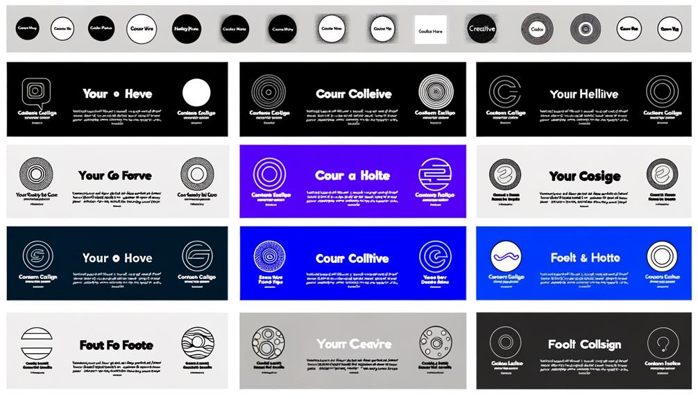
Incorporating the company's logo in the footer of a website reinforces brand identity and enhances visual recognition for visitors.
When it comes to the logo in website footers, there are a few key considerations to keep in mind:
- Different presentation: The logo can be showcased differently than in the header, such as by increasing the font size or adding an image to make it stand out.
- Complementary information: Including a mission statement or brand values below the logo can be effective in reinforcing the brand's message.
- Consistent branding: Ensuring that the logo in the footer aligns with the overall branding and design of the website is crucial.
- Link to homepage: Making the logo in the footer clickable, leading to the homepage, provides a convenient navigation option for users.
- Mobile optimization: Ensuring that the logo is responsive and visually appealing on all devices, including mobile, is essential for a seamless user experience.
Contact Information
Reinforcing brand identity through the company's logo in the footer, the inclusion of contact information is a critical element for facilitating seamless communication with potential leads. By providing clear and accessible contact details, companies empower visitors to easily reach out, fostering trust and engagement. Below is a table showcasing the various types of contact information commonly included in website footers.
| Type of Contact Information | Description | Purpose |
|---|---|---|
| Direct email address | Convenient communication method | |
| Phone Number | Business contact number | Immediate connection with potential leads |
| Mailing Address | Physical location address | Establishes credibility and trustworthiness |
Social Media Icons
We place social media icons in the website footer to provide users with easy access to our company's profiles on various platforms. Including social media icons in the footer serves several purposes:
- Enhancing user engagement with our brand across multiple social media platforms.
- Encouraging users to follow and connect with us on social media.
- Providing a convenient way for users to share our website content on their own social media accounts.
- Increasing our social media presence and reach through the footer links.
- Demonstrating our commitment to transparency and accessibility by prominently displaying our social media presence.
Email Sign-up Form
Including an email sign-up form in the footer enhances user engagement and facilitates newsletter subscriptions. It allows visitors to easily subscribe to newsletters or updates, contributing to the growth of the company's email list. Placing the email sign-up form in the footer ensures its prominent visibility, making it an effective location for capturing leads.
When designing the email sign-up form, it's essential to maintain a visually appealing and concise layout that complements the overall design of the website. The form should be responsive and adapt to different screen sizes, ensuring accessibility on all devices.
Additionally, testing and optimizing the email sign-up form are crucial for improving user engagement and conversions. By continuously refining the form based on user feedback and data analysis, its effectiveness can be maximized.
Additional Links
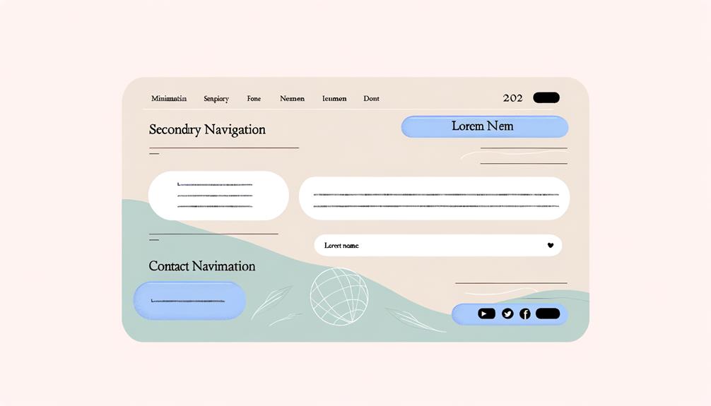
When considering additional links in the website footer, it's essential to prioritize the inclusion of crucial navigation options for improved user experience and ease of access to important pages or resources.
Here are key considerations for incorporating additional links:
- Prioritize essential pages such as About Us, FAQ, and Terms of Service.
- Ensure easy access to resources like customer support, help center, or product documentation.
- Include links to related websites, affiliates, or partners for seamless navigation.
- Integrate shortcuts to important categories or sections for enhanced user convenience.
- Consider incorporating links to legal disclaimers, privacy policies, or cookie consent for transparency.
Design and Layout
Incorporating the principles of minimalism and simplicity in the design and layout of the website footer enhances usability and ensures a clean and visually appealing presentation.
By following a minimalist approach, keeping content concise, and avoiding clutter, the footer becomes more effective. It should complement the overall website design, with organized layout, proper spacing, and alignment.
Furthermore, the footer should be responsive and adaptable to various screen sizes, ensuring a consistent user experience. Embracing a clean and simple design not only enhances usability but also leaves a lasting impression on visitors.
It's essential to continuously test and optimize the footer design based on user feedback and behavioral data for improved usability and conversions.
Responsive Design
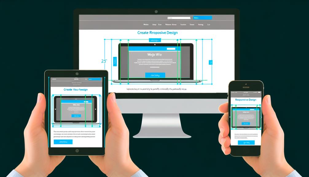
We prioritize ensuring that the footer remains functional and visually appealing on all devices by employing responsive design principles.
- Utilize flexible layouts and images to adapt to various screen sizes.
- Employ media queries to adjust the footer's appearance based on device characteristics.
- Ensure touch-friendly elements for seamless interaction on mobile devices.
- Prioritize content hierarchy to display essential information first on smaller screens.
- Test the footer across different devices and optimize for a consistent user experience.
Responsive design guarantees that the footer maintains its functionality and visual appeal, regardless of the device used. By implementing these principles, we ensure that users have a seamless and engaging experience with the footer, promoting liberation in accessing information across devices.
Minimalism and Simplicity
To ensure the footer maintains its functionality and visual appeal across all devices, we emphasize a minimalist and simple design approach. By keeping the content and elements concise, we avoid clutter and unnecessary information, thus enhancing usability.
A clean and simple footer not only complements the overall website design but also provides a seamless user experience. This approach allows for easy navigation and ensures that the footer remains unobtrusive yet functional.
Embracing minimalism in the footer design promotes liberation from unnecessary distractions, ultimately guiding visitors to the most relevant information. Therefore, simplicity in the footer design not only aligns with the website's visual appeal but also prioritizes the user's freedom to access essential content without overwhelming visual noise.
Creative and Unique Examples
Exploring various websites across different industries provides valuable inspiration for innovative and unique footer designs. When seeking creative and unique footer examples, consider the following:
- Incorporating interactive elements such as hover effects or animations.
- Using unconventional shapes and layouts for the footer section.
- Implementing innovative navigation methods within the footer.
- Showcasing visually striking artwork or graphics in the footer.
- Integrating unexpected and attention-grabbing content in the footer.
These unconventional approaches can captivate visitors and leave a memorable impression, ultimately enhancing the overall user experience.
Testing and Optimization
Testing and optimizing the website footer is crucial for enhancing user experience and maximizing conversions. By conducting A/B testing, heat mapping, and user feedback analysis, we can gather valuable insights into how visitors interact with the footer.
This data allows us to make informed decisions about the layout, content, and functionality of the footer. Continuous optimization based on user behavior and engagement metrics ensures that the footer remains effective in guiding users to relevant information and calls to action. It also contributes to a seamless and satisfying browsing experience, ultimately leading to improved conversion rates.
Through rigorous testing and optimization, we can fine-tune the website footer to better serve the needs and preferences of our audience, driving positive outcomes for both users and the business.
Conclusion
In summarizing our findings and recommendations, we've identified key principles and best practices that underscore the critical role of website footers in enhancing user experience and driving desired outcomes.
The website footer is a crucial component that shouldn't be overlooked, and our research has highlighted the following conclusions:
- The footer serves as a valuable navigation tool and provides essential information.
- Design and layout play a pivotal role in the effectiveness of the footer.
- Responsiveness and minimalism are key elements for optimal footer performance.
- Creative and unique footer designs can leave a lasting impression on visitors.
- Continuous testing and optimization are essential for maximizing the impact of the footer.
Frequently Asked Questions
How Does the Footer Design Impact a Website's Loading Speed?
The footer design directly impacts a website's loading speed. Excessive elements and large files in the footer can slow down the site. By optimizing the footer's content and minimizing unnecessary elements, we can ensure faster loading times.
Eliminating non-essential scripts, compressing images, and reducing the number of requests can significantly improve loading speed. Prioritizing a streamlined footer design is crucial for an efficient user experience and enhanced website performance.
What Are the Best Practices for Integrating Video Content in the Footer?
Integrating video content in the footer can enhance user engagement and convey brand messaging effectively. We recommend using a short, compelling video that complements the website's overall design.
Ensure the video is responsive and doesn't compromise loading speed. Utilize autoplay sparingly, considering user preferences.
Incorporating a call-to-action within the video can encourage user interaction. Regularly evaluate video performance and optimize based on user feedback.
A well-integrated video can elevate the footer's impact.
How Can the Footer Be Used to Showcase Customer Testimonials or Reviews?
We can use the footer to showcase customer testimonials or reviews by incorporating a dedicated section that highlights positive feedback.
This can include quotes, star ratings, or brief customer stories.
By prominently featuring these testimonials in the footer, we can instill trust and credibility, especially for potential customers who've scrolled to the bottom of the page.
This practice can significantly influence purchasing decisions and enhance the overall user experience.
What Are Some Innovative Ways to Incorporate Interactive Elements in the Footer?
Innovative ways to incorporate interactive elements in the footer include:
- Dynamic hover effects on links
- Revealing hidden content on click
- Implementing scroll-triggered animations
These elements engage users and enhance their experience.
Additionally, integrating a live chat feature or a mini quiz can create interactive engagement.
Such dynamic features not only captivate visitors but also encourage them to explore more of the website's content, ultimately boosting user interaction and satisfaction.
What Are the Potential SEO Implications of Footer Design Choices?
When considering footer design choices, potential SEO implications shouldn't be overlooked. Careful attention to elements such as sitemaps, links, and content can impact search engine rankings.
Optimizing the footer for user experience and search engine visibility is crucial. Properly structured and organized footers can improve site navigation, enhance SEO, and contribute to overall website performance.
Strategic design choices in the footer can positively influence SEO outcomes.
Conclusion
In conclusion, website footers are a crucial element in enhancing user experience and reinforcing brand identity. By incorporating elements such as copyright notices, privacy policy links, and contact information, web designers can improve navigation and provide important information to users.
The examples showcased in this article demonstrate the creative possibilities for footer design, and the importance of testing and optimization techniques can't be overstated.
Overall, a well-crafted footer is essential for optimal usability and shouldn't be overlooked in website design.

