
As web developers, we understand that 94% of users cite easy navigation as the most important website feature.
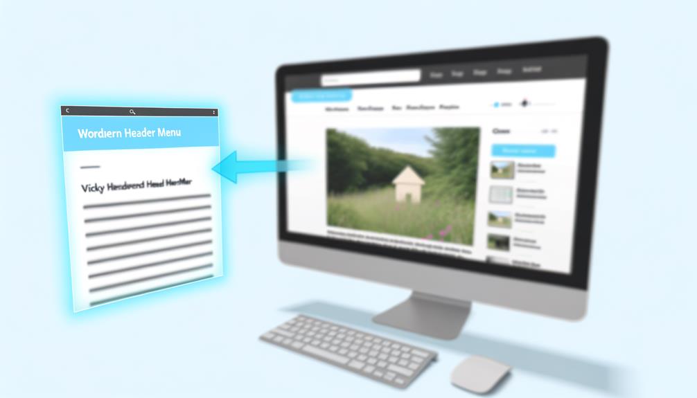
Creating a sticky header menu or navbar in WordPress is a crucial step in enhancing user experience and increasing engagement on your website.
The ability to keep essential links and content easily accessible as users scroll down the page can significantly impact user interaction and conversion rates.
In this article, we will delve into the various methods and best practices for creating a sticky header menu, providing you with the knowledge and tools to implement an effective and visually appealing navigation system on your WordPress website.
Sticky Menu Basics
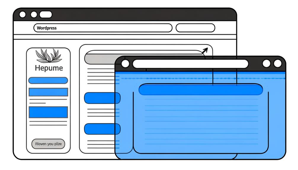
Sticky menus, a staple feature in modern web design, enhance user experience by keeping the navigation bar fixed at the top of the page as users scroll. They provide easy access to essential links and enhance website navigation, creating a seamless browsing experience.
By ensuring that the menu is always visible, users can effortlessly move around the website, leading to higher engagement and satisfaction. Additionally, sticky menus contribute to a sense of familiarity and comfort, as users can quickly access the menu from any point on the page.
This feature is especially beneficial for websites with lengthy content, enabling visitors to navigate without having to scroll back to the top. Incorporating a sticky menu is a simple yet powerful way to improve user interaction and streamline the browsing journey.
Creating a Sticky Menu in WordPress
To enhance website navigation and improve user experience in WordPress, creating a fixed menu at the top of the page as users scroll can be achieved through various methods and plugins.
When creating a sticky menu in WordPress, consider the following options:
- Utilizing CSS to create a sticky navbar
- Employing the myStickymenu plugin for a seamless sticky header menu
- Using the Sticky Menu (or Anything!) on Scroll plugin for effortless sticky menu integration
WordPress Themes With Sticky Menus
When exploring WordPress themes with sticky menus, it's essential to consider their features and compatibility with the sticky menu functionality.
The Soledad theme offers a built-in sticky menu feature, providing a seamless and user-friendly experience for website visitors.
Hello Elementor Theme is another excellent choice, known for its compatibility with sticky menus and its customizable options.
Salient Theme stands out with its sticky menu capabilities, allowing for easy navigation and improved user engagement.
Additionally, the Pro Theme and X Theme both offer robust support for sticky menus, enhancing the overall browsing experience.
These themes not only provide the convenience of a sticky menu but also offer a range of design options and customizations to align with your brand's identity.
Best Practices for Sticky Menus
Exploring the best practices for sticky menus allows us to optimize user experience and enhance website functionality, building on the robust support offered by WordPress themes like Soledad, Hello Elementor, Salient, Pro, and X.
When implementing sticky menus, it's essential to:
- Ensure the menu is visually appealing and on-brand
- Use colors and logos that align with the overall website design
- Streamline the menu items for simplicity and relevance
- Include only the most essential and pertinent navigation options
- Prioritize mobile responsiveness and usability
- Design a custom sticky menu that adapts seamlessly to different mobile devices and screen sizes
Additional Sticky Menu Features
Implementing advanced animation effects on a sticky menu can enhance user engagement and visual appeal. Adding subtle hover animations to the menu items can draw attention and create a more interactive browsing experience. A/B testing different animation styles can help in determining the most effective approach for a specific website.
Additionally, incorporating smooth transition effects when the sticky menu becomes fixed can provide a polished and seamless user experience. It's important to consider the overall design and branding of the website when adding these features to ensure that they align with the site's aesthetic.
Enhancing Sticky Menus With Animations
Enhancing the visual appeal and interactivity of a sticky menu involves implementing advanced animation effects, such as subtle hover animations and smooth transition effects, which can significantly enhance user engagement and browsing experience.
When considering animations for a sticky menu, it's important to:
- Prioritize subtle animations to avoid overwhelming the user
- Utilize smooth transition effects for a seamless user experience
- Ensure that animations complement the overall website design and branding.
Optimizing Sticky Menus for User Experience
To optimize the user experience with sticky menus, it is essential to focus on intuitive navigation and seamless interaction. A well-designed sticky menu should enhance user experience by providing easy access to essential website features. Here's a breakdown of key elements to consider when optimizing sticky menus:
| Key Element | Description |
|---|---|
| Clear Labels | Use concise and clear labels for menu items to ensure users can easily identify their purpose. |
| Responsive Design | Ensure the sticky menu is responsive and adapts seamlessly to different screen sizes. |
| Fast Loading | Optimize the menu for fast loading times to provide a smooth and efficient user experience. |
| Accessibility and Visibility | Ensure the menu is accessible and remains visible as users scroll through the website. |
Frequently Asked Questions
How Can I Make My Sticky Menu Stand Out and Align With My Brand's Visual Identity?
We can make our sticky menu stand out and align with our brand's visual identity by focusing on color scheme, typography, and logo placement.
Utilizing our brand's primary colors and font styles in the menu design creates visual consistency.
Incorporating our logo into the sticky menu enhances brand recognition.
What Are the Best Practices for Integrating a Sticky Menu With E-Commerce Websites?
When integrating a sticky menu with e-commerce websites, we prioritize a seamless user experience. Our best practices include:
- Ensuring the menu is easily accessible on all devices
- Customizing it to match the brand's visual identity
- Prioritizing relevant menu items
We also recommend incorporating filter and discover buttons for easy navigation.
Are There Any Specific Considerations for Creating a Sticky Menu for a Multi-Language Website?
When creating a sticky menu for a multi-language website, it's crucial to ensure that the menu items are easily translatable and that the sticky menu layout accommodates longer text in different languages.
We should also consider incorporating language switcher options within the sticky menu for seamless navigation.
Consistency in design and placement across language versions is key to providing a user-friendly experience for multilingual visitors.
How Can I Ensure That My Sticky Menu Is Accessible and User-Friendly for People With Disabilities?
We ensure our sticky menu is accessible and user-friendly for people with disabilities by following web accessibility standards. This entails using clear, descriptive labels for menu items, providing keyboard navigation, and ensuring sufficient color contrast.
We also consider screen reader compatibility and offer alternative text for menu icons.
Can I Integrate Social Media Icons or Other Interactive Elements Into My Sticky Menu for Enhanced User Engagement?
Yes, we can integrate social media icons or other interactive elements into the sticky menu for enhanced user engagement.
By incorporating social media icons, users can easily access your social profiles, increasing interaction.
Interactive elements like search bars or call-to-action buttons can also enhance user engagement.
These additions can make the sticky menu a powerful tool for promoting user interaction and driving traffic to important areas of your website.
Conclusion
In conclusion, creating a sticky header menu or navbar in WordPress is a crucial step in enhancing user experience and accessibility on your website. By following the best practices and utilizing the various methods discussed in this article, you can ensure that your sticky menu is visually appealing, mobile responsive, and effectively guides users to essential content.
With the right tools and knowledge, you can create an effective and user-friendly sticky menu for your WordPress website.

