In the world of marketing, fonts are the unsung heroes that silently influence the way our brand speaks to the world. They are the subtle yet powerful tools that shape our audience's perception and guide their understanding of our message.
As marketers, we are entrusted with the crucial task of selecting the right fonts that not only reflect our brand's personality but also resonate with our target market.
So, how do we navigate this intricate landscape of typography to make informed and impactful choices? Join us as we unravel the art and science of font selection, exploring the factors that underpin our decisions and the strategies that lead to compelling visual storytelling.
Understanding Font Selection Factors
Understanding font selection factors involves considering various elements such as brand message, typography inspiration, font delivery services, and visual hierarchy to make informed and impactful font choices.
Conveying the brand message through fonts is crucial for creating a strong and cohesive identity. By studying typography inspiration and trends, we can draw valuable insights to make our font choices resonate with our audience.
Selecting the right font delivery service ensures that our chosen fonts are consistently rendered across different platforms. Additionally, comparing fonts side-by-side and understanding the visual hierarchy of our content allows us to make the best choices for our design needs.
Conveying Brand Personality Through Fonts
To effectively convey brand personality through fonts, we prioritize understanding the psychology of font choices and drawing inspiration from other designers to ensure our font selections reflect our brand voice and values.
By selecting fonts that align with our brand's identity, we can create a visual representation of our personality. It's essential to use fonts that resonate with our target audience and evoke the desired emotions and perceptions.
Drawing inspiration from current typography trends and studying the impact of different typefaces on viewer perceptions allows us to make informed font choices. Our font selections shouldn't only enhance the visual appeal but also communicate the essence of our brand.
Through thoughtful font selection, we can establish a strong and consistent brand identity that resonates with our audience.
Font Delivery Service Selection
When selecting a font delivery service, it's crucial to choose a platform that provides a wide range of high-quality fonts to ensure consistency and optimal rendering across various web browsers and devices. We recommend considering the following criteria:
- Font Variety: Look for a service offering a diverse collection of fonts to cater to different design needs.
- Cross-Platform Compatibility: Ensure the service supports seamless font rendering across various web browsers and devices.
- Filtering Options: Opt for a service that allows filtering based on typography characteristics to find the perfect font quickly.
- User-Friendly Interface: Choose a service with an intuitive interface for easy font comparison and selection.
Selecting the right font delivery service is essential for maintaining a cohesive brand image and enhancing the visual appeal of your marketing materials.
Comparing and Evaluating Fonts
We compare potential font combinations visually and prioritize font attributes over color during the selection process for optimal marketing impact. By focusing on font characteristics such as style, weight, and readability, we ensure that our chosen fonts effectively convey our brand message.
Visual comparison allows us to assess the harmony and cohesion of different typefaces, leading to informed decisions that resonate with our brand personality. Emphasizing font attributes over color enables us to make choices that prioritize readability and visual hierarchy, essential for capturing and retaining audience attention.
This deliberate approach ensures that our font selections align with our brand values and effectively communicate with our target audience. By evaluating fonts based on their intrinsic qualities, we empower our marketing materials to make a lasting and meaningful impact.
Choosing Fonts for Visual Hierarchy
Careful consideration of the visual hierarchy on a website guides our font selection, ensuring optimal readability and efficient communication with our audience. When choosing fonts for visual hierarchy, we focus on:
- Headline and Body Fonts: Utilize two distinct fonts for headlines and body copy to establish a clear visual hierarchy.
- Scannability: Create a visual hierarchy that allows viewers to quickly scan content, making it easier for them to find the information they need.
- Legibility Optimization: Optimize font legibility by selecting appropriate font faces, sizes, letter spacing, and line height.
- Efficient Communication: Ensure that the chosen fonts aid in efficient communication of your brand message, values, and personality.
Reflecting Brand Voice With Fonts
How can fonts be strategically chosen to authentically reflect a brand's unique voice and values, capturing the attention and trust of the intended audience?
Selecting fonts that align with the brand's personality and message is crucial. Consider the emotional response different fonts evoke and ensure they resonate with the brand's identity. Fonts should convey the intended tone, whether it's bold and assertive or friendly and approachable.
Drawing inspiration from successful brands can provide valuable insights. Understanding the psychological impact of different typefaces on viewers is essential. Utilize tools to analyze and draw inspiration from competitors and well-known brands.
Exploring Font Delivery Services
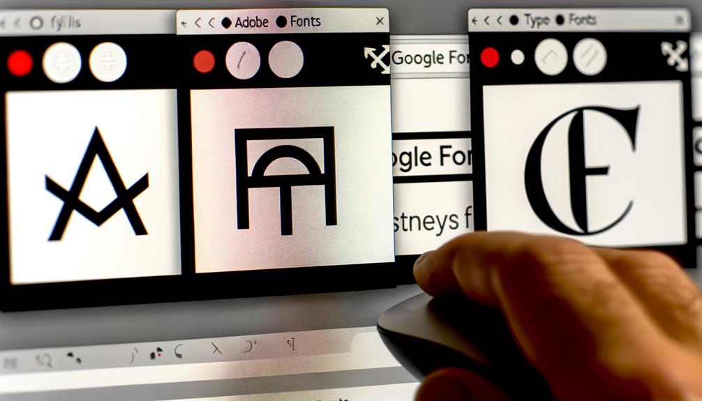
When exploring font delivery services, it's essential to select a reliable platform that offers a wide range of fonts to meet the diverse needs of marketing and branding projects. Here are key factors to consider:
- Diverse Font Collection: Look for a service that provides a wide selection of fonts, including serif, sans-serif, display, and script fonts to cater to various design requirements.
- Compatibility and Consistency: Ensure the service offers consistent rendering of fonts across different web browsers and devices, guaranteeing a seamless experience for users.
- Filtering and Comparison Tools: Seek a platform that allows for easy filtering based on typography characteristics and offers features for comparing and saving shortlisted fonts for review.
- Subscription Options: Consider services that provide subscription-based models, offering access to a comprehensive library of fonts for a predictable cost.
Selecting the right font delivery service is crucial for achieving impactful and effective marketing designs.
Making Informed Font Comparisons
Selecting the most suitable font for your marketing materials requires a thorough and strategic comparison of typefaces to ensure optimal visual impact and brand alignment.
When making informed font comparisons, it's essential to create a visual comparison of potential font combinations. Focus on font attributes rather than color during the selection process, considering the impact of color on viewers' psychology and behavior.
Choose fonts and colors as separate steps in the branding design process and use black and white visuals to evaluate font options effectively.
By making informed font comparisons, you can determine the visual hierarchy of your website, guide font selection, and optimize font legibility by choosing appropriate font faces.
This approach allows you to create a cohesive and visually appealing brand identity that resonates with your audience.
Emphasizing Readability in Font Selection
To build upon our understanding of making informed font comparisons, it's imperative to prioritize readability in font selection to ensure that your marketing materials effectively communicate your brand message and engage your audience. When emphasizing readability in font selection, consider the following:
- Font Legibility: Choose fonts with clear, distinguishable letterforms.
- Appropriate Font Size: Ensure that the font size is large enough to be easily read across various devices.
- Proper Letter Spacing: Opt for adequate spacing between letters to enhance readability.
- Optimized Line Height: Select an appropriate line height to improve the readability of your content.
Frequently Asked Questions
What Are Some Common Mistakes to Avoid When Choosing Fonts for Marketing Materials?
When choosing fonts for marketing materials, we must avoid common mistakes that can undermine our brand's message. These include:
- Using too many fonts
- Neglecting readability
- Failing to consider the visual hierarchy
By focusing on conveying brand personality, utilizing font delivery services, and comparing fonts effectively, we can make the right choices for our marketing materials.
These strategies ensure that our fonts reflect our brand's voice and values, resonate with our audience, and enhance the overall appeal of our marketing materials.
How Can Fonts Impact the Overall User Experience on a Website or Marketing Collateral?
Fonts impact the user experience by influencing readability, conveying brand personality, and guiding visual hierarchy. They can evoke emotions, create a sense of trust, and enhance the overall aesthetic appeal.
Proper font selection ensures easy navigation and a clear message, while the wrong fonts can confuse and frustrate users. Consistency in font usage across marketing collateral and websites is crucial for maintaining brand identity and engaging users effectively.
Are There Any Specific Cultural Considerations to Keep in Mind When Selecting Fonts for a Global Audience?
When selecting fonts for a global audience, it's crucial to consider cultural nuances. Different cultures may have specific preferences and associations with certain typefaces. Understanding these cultural considerations can ensure that the chosen fonts resonate with diverse audiences.
Factors like symbolism, readability, and historical connotations should be taken into account. By acknowledging cultural diversity, we can create inclusive and impactful designs that effectively communicate across borders.
What Are Some Emerging Trends in Typography That Marketers Should Be Aware Of?
Emerging trends in typography that marketers should be aware of include:
- Variable fonts, which offer flexibility and creativity.
- The use of geometric and retro-inspired typefaces for a modern yet nostalgic feel.
Additionally, kinetic typography in video marketing is gaining traction, allowing dynamic and engaging visual storytelling.
Incorporating these trends into marketing materials can enhance brand identity, capture attention, and create memorable experiences for the audience.
How Can Data and Analytics Be Used to Inform Font Selection for Marketing Purposes?
Data and analytics inform font selection for marketing by guiding us on viewer preferences and behaviors. We analyze metrics like engagement, conversion rates, and user feedback to understand which fonts resonate with our audience.
This data-driven approach ensures our font choices align with our brand message and appeal to our target demographic. By leveraging data, we optimize our marketing materials to effectively communicate with our audience and drive desired actions.
Conclusion
In conclusion, choosing the right fonts for our marketing efforts is essential for effectively communicating our brand's message and connecting with our target audience.
By considering factors such as brand personality, visual hierarchy, and readability, we can make informed decisions that strengthen our brand identity.
Leveraging font delivery services and staying updated on design trends will further enhance the impact of our marketing materials.
With the right fonts, we can truly elevate our marketing efforts and leave a lasting impression.

