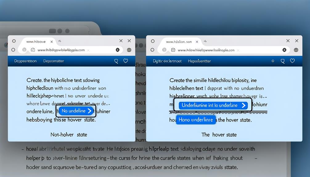
As web designers and developers, we are constantly navigating the intersection of functionality and aesthetics, aiming to guide users through our digital spaces with finesse.
Have you ever wondered how to seamlessly add a touch of interactivity and elegance to your website's text content? Hover effects are a powerful tool in our arsenal, and in this discussion, we will unravel the art of CSS underline on hover.
Whether you're looking to master the basics or explore more advanced techniques, we've got you covered. Stay with us to uncover the secrets of crafting captivating hover underlines that not only captivate attention but also serve a practical purpose in enhancing user experience.
Basic Underline-on-Hover Implementation
To implement a basic underline-on-hover effect, we simply need to apply a few lines of HTML and CSS to create a visually engaging hover effect for links on a webpage.
First, we create the text using the anchor element in HTML.
Then, we remove the default underline using the text-decoration property in CSS.
Next, we use the :hover pseudo-class to apply a rule when the cursor hovers over the anchor element, creating the underline effect.
Additionally, we can enhance the effect by changing the cursor to a pointer when hovering over the link.
Text Creation With HTML
Let's begin by creating text using the anchor element in HTML to lay the foundation for our webpage's content.
- The anchor element `<a>` is used to create hyperlinks.
- It requires the href attribute to specify the destination of the link.
- The anchor text is placed between the opening and closing `<a>` tags.
This approach provides a clear and concise method for creating text and linking it to other resources.
Default Underline Removal
Certainly! Regularly removing default underlines from links can improve visual design but requires careful consideration for accessibility. When removing default underlines, it's important to provide alternative visual indicators to ensure that all users can easily identify clickable elements. Below, we've outlined some common techniques for default underline removal and their potential impact on accessibility.
| Technique | Description |
|---|---|
| Text Decoration | Removing the default underline using the text-decoration property in CSS. |
| Background Image | Using a background image to create custom underline styles. |
| Border Bottom | Applying a border-bottom style to mimic the underline effect. |
| Box Shadow | Utilizing box shadow to create an underline-like appearance. |
CSS Pseudo-class :hover Usage
We will demonstrate how to effectively utilize the CSS pseudo-class :hover to create engaging and accessible hover effects.
- When the cursor hovers over an element, the :hover pseudo-class can be used to change the style of the element, such as adding an underline to a link.
- This creates a visually engaging indication of interactivity for the user.
Cursor Pointer Change on Hover
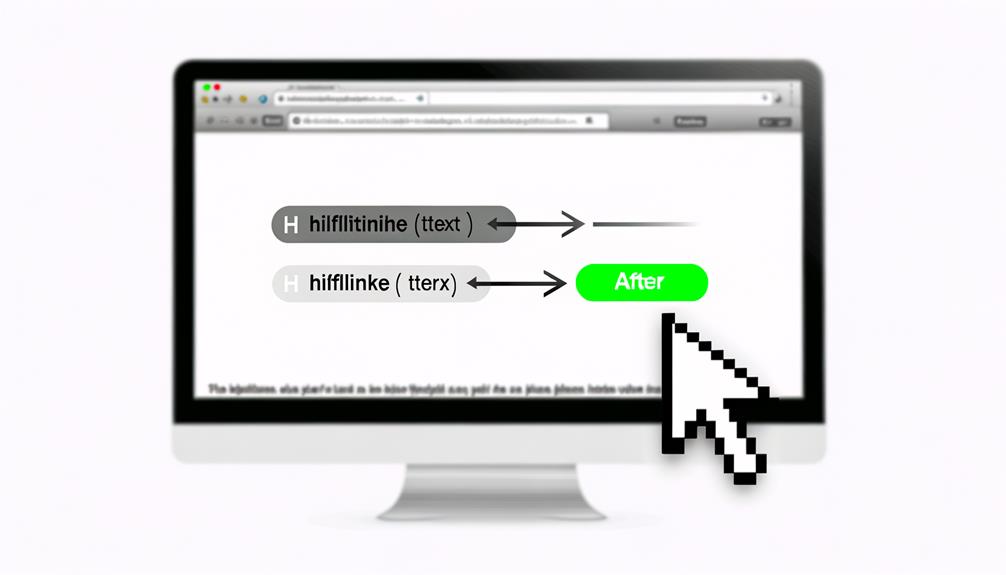
When creating hover effects, it's essential to consider changing the cursor to a pointer to provide a clear visual indication of interactivity for the user. This simple adjustment enhances user experience by clearly communicating that an element is clickable.
By changing the cursor to a pointer on hover, we empower users to easily identify interactive elements, encouraging engagement and exploration. This small yet impactful change can greatly improve the usability of a website or application.
It's a liberating experience for users when they can effortlessly navigate and interact with elements, knowing exactly where and how they can engage. By making this adjustment, we contribute to a more intuitive and user-friendly digital environment, promoting a sense of empowerment and freedom for all users.
Link Underlines and Accessibility
Considering the significance of link underlines for accessibility, it's crucial to ensure that visual indicators are thoughtfully incorporated to facilitate user interaction with website content.
- Visual indicators like underlines are crucial for users with visual impairments or color vision deficiencies.
- Removing underlines requires clear alternative indicators for clickable text.
Meeting accessibility standards, such as the 3:1 contrast ratio and non-color designators, is essential.
Implementing hover effects should prioritize accessibility without compromising user experience.
- Balancing elegance and simplicity can lead to effective, inclusive hover effects.
Experimentation and creativity can result in unique and engaging hover effects that liberate users from accessibility barriers.
Web Content Accessibility Guidelines (WCAG)
The significance of link underlines for accessibility underscores the importance of adhering to the Web Content Accessibility Guidelines (WCAG) for creating an inclusive user experience. Following WCAG ensures that web content is accessible to people with disabilities, including those with visual impairments.
It mandates the use of underlines or other clear visual indicators for hyperlinks, as removing underlines can hinder accessibility. Additionally, WCAG emphasizes the need for sufficient color contrast between link text and its surrounding non-link text, benefiting users with color vision deficiency.
Examples of Hover Underline Usage
Examples of hover underline usage can be found in various modern website designs, showcasing creative and engaging ways to indicate interactive links.
- Apples website uses the hover underline effect on its main page links. The subtle underline adds a touch of elegance and indicates interactivity without overwhelming the design.
- Pitchfork, a music news and review website, fades the text to red and removes the underline on hover. This approach creates a visual cue that the link is interactive while harmonizing with the overall aesthetic of the website.
Expanding Underline Effect
The expanding underline effect adds subtle visual flair to website navigation links, enhancing interactivity and user engagement. It introduces a dynamic element to the hover experience, capturing users' attention and guiding their focus.
This effect can be achieved using CSS animations to create a smooth and seamless transition that provides a pleasing user experience. By incorporating the expanding underline effect, websites can elevate the overall design aesthetic and create a more engaging and interactive interface.
This subtle yet effective visual enhancement not only adds a touch of elegance but also serves as a clear indicator of link interactivity. By implementing this technique, websites can offer a unique and visually engaging user experience, ultimately leading to increased user satisfaction and interaction.
Creating Unique CSS Hover Effects
Let's explore various techniques for creating unique CSS hover effects to enhance user interaction and visual appeal on web pages.
- Techniques for Creating Unique CSS Hover Effects:
- Experiment with unconventional color transitions and gradients to make the hover effect stand out.
- Incorporate subtle animations, such as scaling or fading, to add a touch of elegance and sophistication to the hover effect.
Frequently Asked Questions
How Can the Hover Underline Effect Be Customized to Match a Specific Website's Design Aesthetic?
To customize the hover underline effect for a specific website's design aesthetic, we can utilize unique CSS properties and values to match the desired look and feel. By experimenting with color, animation, and transitions, we can create a visually engaging effect that aligns with the website's design language.
Balancing elegance and simplicity, we can ensure the hover underline effect complements the overall aesthetic, nudging users towards the desired outcome while maintaining accessibility and user experience.
Are There Any Best Practices for Incorporating Hover Underline Effects for Users With Color Vision Deficiency or Visual Limitations?
Incorporating hover underline effects for users with color vision deficiency or visual limitations is crucial for accessibility.
Best practices include maintaining a 3:1 contrast ratio between link text and surrounding non-link text, and using a non-color designator, such as the underline introduced on hover, to indicate a link.
It's essential to balance elegance and simplicity when designing hover effects to ensure they're engaging and accessible for all users.
What Are Some Common Mistakes to Avoid When Implementing Hover Underline Effects for Accessibility?
When implementing hover underline effects for accessibility, it's crucial to avoid removing underlines from links without clear visual indicators. Changing color alone can be inaccessible to users with color vision deficiency or visual limitations.
We must ensure a 3:1 contrast ratio between link text and surrounding non-link text, as per WCAG guidelines.
Balancing elegance and simplicity is key for effective hover effects, and experimentation can lead to unique and engaging results.
Is It Possible to Create a Hover Underline Effect That Includes Additional Visual Indicators Beyond Just the Underline?
Yes, it's possible to create a hover underline effect that includes additional visual indicators beyond just the underline. By utilizing CSS, we can combine the underline effect with changes in color, text opacity, or even background transitions to provide a more robust visual cue for user interactivity.
This approach enhances accessibility and user experience by offering multiple visual indicators when a link is hovered over, improving clarity and engagement.
Are There Any Tools or Resources Available for Testing the Accessibility of Hover Underline Effects on a Website?
Yes, there are tools and resources available for testing the accessibility of hover underline effects on a website.
We can use the WAVE Web Accessibility Evaluation Tool and Axe Accessibility Testing to ensure that our hover underline effects meet the accessibility standards.
These tools help us identify any accessibility issues and provide guidance on how to make the hover effects more inclusive for all users.
Conclusion
In conclusion, mastering the art of CSS underline effects for hover interactions can greatly enhance the user experience on websites.
By implementing basic underline-on-hover techniques and exploring more elaborate animations, web designers and developers can capture attention and guide visitors through digital spaces.
It's important to consider accessibility guidelines and diverse user experiences when crafting hover effects, ensuring that they not only look visually appealing but also serve a practical purpose.


