In a world inundated with cookie-cutter website headers, we must challenge the status quo and explore the untapped potential of header design.
The digital landscape is constantly evolving, and so should our approach to captivating and guiding user experience.
As we navigate the intricacies of header design, we uncover the pivotal role it plays in prompting user interaction and reinforcing brand identity.
But what if there's more to it than meets the eye?
Join us as we unravel the secrets of thinking outside the box when it comes to crafting compelling and effective headers.
Understanding Website Headers

Understanding website headers is crucial for creating a captivating and engaging user experience. As creators of online content, we must grasp the power of headers in capturing the attention of our audience and prompting them to take action.
By mastering the art of header design, we liberate ourselves from the constraints of ordinary web experiences and empower our users to explore, engage, and interact with our content. We strategically utilize elements such as branding, calls-to-action, and navigation tools to guide our audience through a seamless and purposeful journey on our website.
With a clear understanding of website headers, we assert our influence in shaping a user-friendly digital environment that encourages exploration and liberation. Let's strategically harness the potential of headers to transform the way users engage with our online content.
Key Elements of Header Design
In crafting a compelling website header, we strategically integrate key elements to captivate and guide our audience's online journey. Below are the essential elements that we incorporate into our header design to ensure an impactful and engaging user experience.
| Key Elements | Description |
|---|---|
| Consistent Branding | Incorporating logo and brand identity to establish recognition and trust. |
| Clear Navigation | Providing easy access to essential pages, enhancing user experience and site interaction. |
| Engaging CTAs | Including compelling calls-to-action to prompt specific user actions and increase engagement. |
| Responsive Design | Ensuring adaptability across various devices, optimizing speed and user accessibility. |
Branding and Consistency
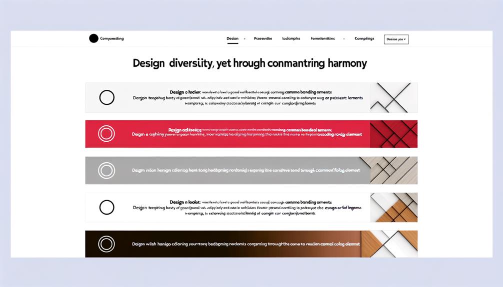
To establish a cohesive and recognizable brand identity, we purposefully integrate the logo and branding elements into the website header, fostering trust and familiarity with our audience. By consistently presenting our brand elements in the header, we solidify our presence and convey a sense of reliability and professionalism.
This strategic approach ensures that visitors instantly recognize our brand and feel confident engaging with our content. Through this intentional placement, we liberate our brand from obscurity and create a lasting impression that resonates with our audience.
Our header becomes a powerful tool for reinforcing our brand identity, instilling confidence, and guiding users through a seamless and familiar experience. Embracing consistency in branding within the header empowers our brand to stand out and make a lasting impact.
Calls-to-Action in Headers
Embracing consistency in branding within the header empowers our brand to immediately capture attention and guide users through a seamless and familiar experience, making the strategic placement of calls-to-action (CTAs) a pivotal factor in driving specific user actions. To convey a deeper meaning, consider the following table:
| CTA Type | Purpose |
|---|---|
| Newsletter Sign-up | Build an engaged subscriber base |
| Explore Offerings | Encourage users to discover products/services |
| Free Trial | Prompt users to experience products/services |
Strategically positioned CTAs prompt liberation by guiding users toward desired actions, fostering a sense of empowerment and control. By incorporating compelling CTAs, our brand liberates users to engage and explore, ultimately driving meaningful interactions.
Design Best Practices

Let's craft a powerful and captivating design that embodies our brand's essence and captivates our audience with an alluring and impactful website header. When it comes to design best practices, we must aim for nothing short of excellence.
Our header should be a reflection of our brand's identity and values, leaving a lasting impression on our visitors. To achieve this, we must:
- Prioritize visual appeal and simplicity
- Provide clear direction through compelling CTAs and prominent links
- Ensure consistency in design and layout across all pages
The Role of Headers
Crafting a powerful and captivating design that embodies our brand's essence and captivates our audience with an alluring and impactful website header paves the way for understanding the crucial role headers play in shaping user interaction and experience.
Headers serve as the initial point of contact, setting the tone for the entire website experience. They guide users, provide essential navigation, and establish brand identity.
Additionally, headers play a pivotal role in capturing attention, directing focus, and prompting desired actions through strategic placement of calls-to-action (CTAs). By strategically integrating branding elements, navigation tools, and compelling CTAs, headers become powerful tools for engaging and guiding users, ultimately influencing their interactions and experiences on the website.
Understanding the pivotal role of headers empowers us to create designs that not only reflect our brand but also liberate and captivate our audience.
Types of Website Headers
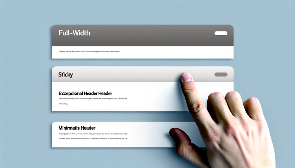
Understanding the different types of website headers is essential for creating a strategic and impactful design that effectively caters to user interaction and experience. When it comes to website headers, it's crucial to consider various types to ensure an engaging and user-friendly design.
Here are three key types of website headers to consider:
- Fixed Header: Enhances user navigation and accessibility.
- Overlay Header: Offers a modern and sleek design, optimizing space.
- Video Header: Captivates attention and creates a dynamic visual appeal.
Guidelines for Header Design
When crafting a compelling website header design, it's vital to prioritize visual appeal and functionality to capture user attention effectively.
Our guidelines for header design focus on liberation and strategic thinking. Embrace visual appeal by employing vibrant imagery and captivating typography. Ensure functionality by integrating clear navigation tools and prominent calls-to-action.
Simplicity is key – eliminate clutter and prioritize essential elements for a clean, impactful design. Emphasize your brand identity through consistent logo placement and color schemes.
Stay influential by directing user attention with visual hierarchy techniques, guiding them towards desired actions. Remember, speed and responsiveness are non-negotiable – optimize your header for seamless performance across all devices.
Effective CTAs in Headers
As we pivot from prioritizing visual appeal and functionality in header design, our focus now shifts to implementing impactful and compelling calls-to-action (CTAs) within the header to prompt specific user actions.
- Craft CTAs that inspire action
- Utilize persuasive language to drive engagement
- Design CTAs that stand out and command attention
Effective CTAs in headers are pivotal in driving user engagement and prompting desired actions. By crafting CTAs that inspire action, utilizing persuasive language to drive engagement, and designing CTAs that stand out and command attention, we can strategically guide users towards meaningful interactions with our website.
Embracing the power of impactful CTAs liberates us from passive user interactions, empowering us to direct and inspire our audience effectively.
Optimizing Header Performance
To enhance website performance, we strategically optimize the header for speed and responsiveness across various devices. By prioritizing efficiency and adaptability, we ensure that the header contributes to a seamless user experience. Our approach to optimizing header performance involves careful consideration of key elements that directly impact speed and responsiveness. Below is a table outlining our strategic methods for header optimization:
| Optimization Method | Description | Impact |
|---|---|---|
| Image Compression | Compressing header images to reduce file size | Faster load times |
| Minimizing HTTP Requests | Consolidating and reducing external requests | Improved responsiveness |
| Responsive Design | Adapting the header layout for different devices | Enhanced user experience |
| Caching | Storing header elements for quicker retrieval | Accelerated load times |
| Code Minification | Condensing and optimizing header code | Improved performance |
Frequently Asked Questions
How Can Headers Be Used to Convey a Brand's Unique Personality and Identity?
Headers convey a brand's unique personality and identity by incorporating consistent branding elements, such as logos and color schemes, and using compelling calls-to-action that reflect the brand's values.
We prioritize visually appealing design, simplicity, and strategic use of CTAs to guide user interaction.
What Are Some Creative Ways to Incorporate Interactive Elements Into Website Headers?
Let's think outside the box and consider innovative ways to incorporate interactive elements into website headers.
By integrating engaging features such as interactive animations, dynamic sliders, or live chat options directly into the header, we can captivate visitors and encourage immediate interaction.
This strategy not only enhances user experience but also sets our brand apart, fostering a sense of uniqueness and modernity.
Let's revolutionize our headers to captivate and engage our audience.
Can Headers Be Utilized to Effectively Showcase Promotional Offers or Discounts?
Absolutely, headers can effectively showcase promotional offers or discounts. We've seen great success in integrating eye-catching banners or sliders in the header space, drawing immediate attention to special deals.
Utilizing compelling visuals and succinct messaging, we've driven higher engagement and conversions. By strategically placing these offers at the forefront of the website, we've increased customer interest and satisfaction.
This approach aligns with our commitment to maximizing user experience and boosting sales.
What Are Some Unconventional Design Techniques That Can Make a Header Stand Out and Grab User Attention?
We can make a header stand out and grab user attention by embracing bold visuals, unexpected layouts, and innovative animations.
By challenging traditional design norms, we can captivate users and inspire engagement. Leveraging unconventional techniques, such as interactive elements or unique typography, can cultivate a sense of curiosity and excitement.
Embracing creativity and originality in header design allows us to break free from the ordinary and leave a lasting impression on our audience.
How Can Headers Be Optimized to Cater to Users With Disabilities or Accessibility Needs?
We can optimize headers to cater to users with disabilities or accessibility needs by ensuring clear and concise text, using high color contrast for better readability, and providing alternative text for images.
We must also prioritize keyboard navigation and ensure compatibility with screen readers. Embracing accessibility not only broadens our reach but also aligns with ethical and inclusive design practices.
Let's lead by example and make our headers accessible to all.
Conclusion
In conclusion, it's clear that website headers play a crucial role in shaping user experience and reinforcing brand identity.
By embracing innovative design, strategic placement of calls-to-action, and a focus on visual appeal and simplicity, web designers can create headers that captivate and guide users effectively.
It's time to think outside the box and push the boundaries of traditional header design to create compelling, impactful experiences for users.


