Looking to elevate your website's visual appeal and make a lasting impression on your audience? We've all come across web banners that leave us captivated and eager to explore further. But what makes these banners stand out?
In this discussion, we'll uncover 15 web banner design ideas that not only grab attention but also drive engagement and conversions. From the strategic use of color and imagery to the placement and purpose of web banners, these ideas are tailored to help you create a site that leaves a lasting impact.
Whether you're a seasoned designer or just starting out, these insights will equip you with the tools to craft compelling web banners that truly stand out.
Importance of Web Banners
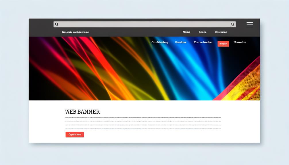
Web banners are essential marketing tools that effectively direct visitors and significantly contribute to increasing website traffic, leads, and sales. With strategic placement and eye-catching designs, web banners have the power to capture attention and drive action.
They play a crucial role in modern marketing strategies, offering a cost-effective way to reach a targeted audience and promote products or services. The average click-through rate and cost per click demonstrate the effectiveness of web banners in generating interest and conversions.
Elements of a Web Banner
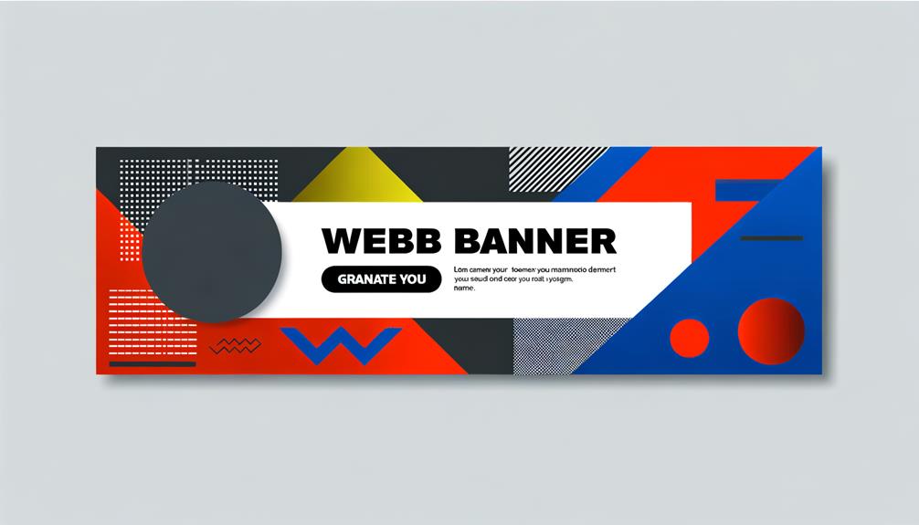
Frequently, when designing web banners, we carefully consider the essential elements such as banner size, color, text, images, and call-to-action to ensure maximum effectiveness in capturing attention and driving desired actions.
- Matching banner size with website dimensions
- Ensures seamless integration and avoids distortion
- Enhances overall visual appeal and professionalism
- Conveys a cohesive brand message and image
- Choosing colors that complement the message
- Establishes a strong visual hierarchy and impact
- Evokes emotions and conveys the intended message
- Enhances brand recognition and memorability
- Clear messaging and proper formatting
- Ensures readability and comprehension at a glance
- Guides the viewer's focus and prompts action
- Conveys a compelling message with brevity and clarity
Defining the Purpose of a Web Banner

To effectively create a web banner, it's crucial to clearly define its intended purpose and align it with the overarching marketing goals of the campaign. Whether it's for promoting a specific product, driving traffic to a website, or increasing brand awareness, the purpose of the web banner should be well-defined from the outset.
By determining the business needs and the desired action from the audience, the design, elements, and placement of the web banner can be strategically guided. This clarity ensures that the web banner serves its intended purpose and contributes to the overall success of the marketing campaign.
Defining the purpose of a web banner is the first step toward creating a compelling and effective design that resonates with the target audience and drives desired outcomes.
Choosing the Right Banner Size
Choosing the right banner size plays a crucial role in ensuring optimal visibility and impact, directly influencing the effectiveness of the web banner's message and call-to-action.
When considering banner size, it's important to:
- Tailor sizes to specific platforms and placements
- Ensuring banners fit seamlessly within the designated space
- Adhering to standard sizes for broader compatibility
- Adapting sizes for mobile and responsive design
Using Color Effectively
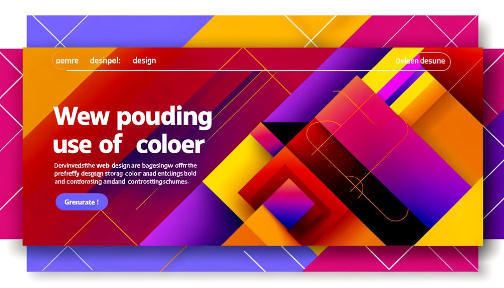
When designing web banners, the effective use of color is essential for capturing attention and conveying the intended message to the audience.
Bold and vibrant colors can grab the viewer's attention, while complementary color schemes can create a visually appealing and harmonious design.
Using contrasting colors strategically can make certain elements, such as call-to-action buttons, stand out.
It's important to consider the psychological effects of different colors and choose ones that evoke the desired emotions.
Additionally, ensuring that the chosen colors align with the overall branding and theme of the website is crucial for a cohesive and professional look.
Creating Clear and Compelling Texts
Craft compelling and clear text in web banners to effectively communicate your message and drive audience engagement. Use concise and impactful language. Deliver your message in a few words. Clearly state the value proposition. Avoid jargon and unnecessary details. Ensure proper formatting and readability. Use easy-to-read fonts. Maintain a hierarchy of information. Utilize appropriate text size and contrast. Incorporate strong calls-to-action. Prompt action with persuasive language. Clearly direct users on what to do next. Create a sense of urgency and relevance.
Crafting compelling text is essential for capturing attention and driving action. By using clear, concise language, proper formatting, and strong calls-to-action, you can effectively convey your message and prompt engagement from your audience.
Selecting Appropriate Images

Selecting the right images for your web banners is crucial for capturing audience attention and effectively conveying your message. High-quality, professional images that resonate with your target audience can significantly enhance the visual appeal and impact of your banners.
It's essential to choose images that are relevant to your content and align with your brand's identity. Avoid generic or overused stock photos, as they can diminish the uniqueness of your banners. Instead, opt for authentic, engaging images that evoke emotions and tell a compelling story.
Whether it's showcasing your products, illustrating concepts, or depicting real-life scenarios, the right images can make a profound difference in the effectiveness of your web banners. By selecting appropriate images, you can create a visually captivating and persuasive banner that resonates with your audience.
Adding Call-to-Actions
To enhance the effectiveness of your web banners, incorporate compelling and visible call-to-action buttons that prompt immediate engagement with your audience. When adding call-to-actions:
- Ensure they're dominant and clickable, standing out prominently on the banner
- Use contrasting colors or bold fonts to make the CTA button visually striking
- Place the CTA where it's easily accessible and aligns with the user's natural flow of attention
- Make the call-to-action related to the purpose of the banner and emotionally compelling
- Use persuasive language that encourages action, such as 'Shop Now' or 'Learn More'
Leverage emotional triggers to evoke a response from your audience. Test different variations to determine the most effective call-to-action for your specific audience. A/B test different CTAs to see which one generates the highest click-through rate. Analyze user behavior to understand which call-to-action prompts the most engagement.
Web Banner Design Ideas
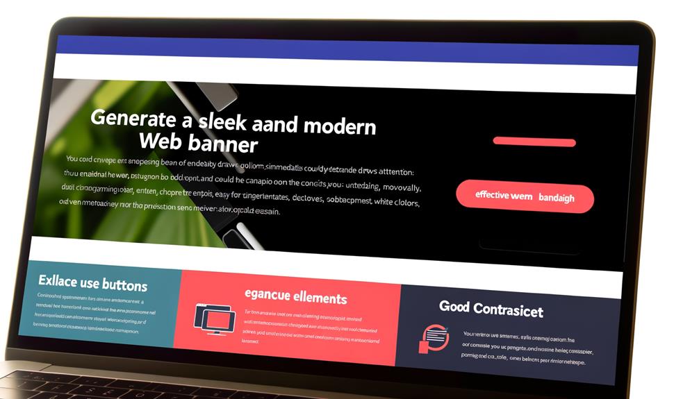
When designing web banners, we aim to capture attention and prompt immediate engagement through creative and visually compelling designs.
One effective idea is to embrace simplicity, using clean and related images that resonate with the audience. Additionally, consider incorporating subtle animations or utilizing sticky side banners to maintain visibility.
Experimenting with contrasting colors can make your banner stand out, creating a visually impactful design. Another approach is to infuse artistic references, making the banner more relatable and engaging.
To further enhance the design, use bright and contrasting colors to make key elements pop and evoke emotion with compelling imagery. Ultimately, the goal is to create visually appealing banners that effectively communicate the intended message and drive user interaction.
Using Contrasting Colors
How can we effectively use contrasting colors to make our web banners visually impactful and attention-grabbing?
- Create Visual Hierarchy:
- Use contrasting colors to highlight important elements like the call-to-action or key message.
- Ensure that the contrast draws the viewer's eye to the most critical parts of the banner.
- Enhance Readability:
- Utilize contrasting colors to improve the legibility of text against the background.
- Ensure that the color contrast doesn't strain the eyes but rather makes the text stand out.
- Evoke Emotions:
- Leverage contrasting colors to evoke specific emotions that align with the brand or message.
- Ensure that the chosen color contrast complements the overall tone of the web banner.
Experimenting With Artistic References
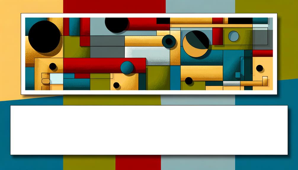
Experimenting with artistic references allows us to infuse relatable art into our web banners, creating a captivating and memorable visual experience for our audience. By incorporating artistic references, we can tap into familiar imagery that resonates with our viewers, evoking emotions and sparking connections.
This approach breaks away from conventional designs, infusing creativity and originality into our banners. It allows us to communicate messages in a unique and visually compelling manner, setting our website apart and leaving a lasting impression.
Through artistic references, we can convey complex ideas in a simplified yet impactful way, making our banners more approachable and engaging. Embracing artistic influences liberates us from traditional constraints, empowering us to create dynamic and visually stunning web banners that captivate and inspire.
Making Colors Pop
To make colors pop in web banners, we strategically select vibrant hues that grab attention and enhance visual appeal.
- Utilize vibrant and bold color choices to seize attention immediately
- Opt for high-saturation colors to create an instant visual impact
- Consider the psychology of color to evoke specific emotions
- Use contrasting colors to make elements stand out and create visual interest
Using Emotion-Evoking Imagery
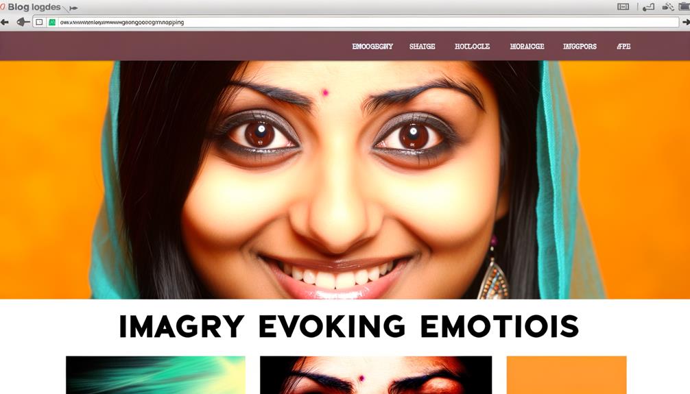
When selecting imagery for web banners, we aim to evoke specific emotions that resonate with our target audience, creating a strong and impactful visual connection.
Emotion-evoking imagery has the power to captivate viewers, stealing attention and creating a lasting impact. By effectively communicating the message through compelling visuals, we can establish a deep and meaningful connection with our audience.
Whether it's joy, inspiration, empathy, or excitement, the right imagery can stir up powerful emotions, driving engagement and fostering a sense of connection with your brand.
When strategically integrated into web banners, emotion-evoking imagery has the potential to leave a lasting impression and drive action. It's essential to leverage the emotive power of imagery to create a memorable and compelling visual experience for your audience.
Creating Contrast With Creative Colors
Creating impactful contrast with creative colors in web banner design is essential for capturing attention and driving engagement.
When it comes to using colors for web banners, there are several key points to consider:
- Choosing Complementary Colors: Pairing colors that are opposite on the color wheel can create striking contrast and make elements stand out.
- Utilizing Vibrant Hues: Bright and bold colors can grab attention and create a visually stimulating experience for website visitors.
- Balancing Contrast: It's important to find a balance between contrasting colors that pop and ensuring they complement each other without clashing.
Banner Placement and Purpose
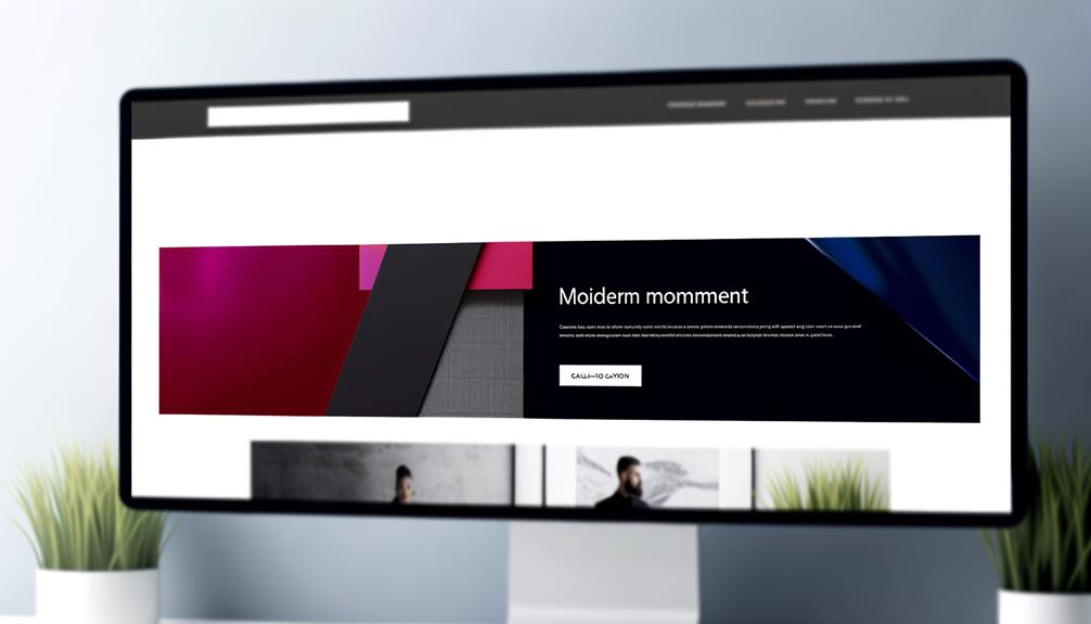
Banner placement and purpose play a crucial role in capturing the attention of website visitors and directing them towards specific marketing messages and calls to action. Placing banners strategically where they're highly visible, such as near the top of a webpage or within the content, can significantly impact user engagement.
Additionally, understanding the purpose of each banner is essential for creating a clear and compelling message. Whether it's to promote a product, encourage newsletter sign-ups, or drive traffic to a particular landing page, the purpose should guide the design and placement.
Frequently Asked Questions
How Can Web Banners Be Optimized for Mobile Devices?
Optimizing web banners for mobile devices is crucial. We ensure readability by using legible fonts and maintaining a clutter-free layout. Our images are compressed to improve loading speed and maintain visual appeal.
We prioritize a responsive design that adjusts seamlessly to different screen sizes. This ensures an optimal user experience across devices.
Our strategy involves testing on various mobile platforms to guarantee flawless functionality and aesthetics.
What Are Some Common Mistakes to Avoid When Designing Web Banners?
When designing web banners, we avoid common mistakes by ensuring clear, compelling text, choosing appropriate images, and using contrasting colors effectively.
We focus on creating a standout effect with intentional color choices, selecting professional and relevant images, and incorporating dominant, visible call-to-action buttons.
How Can A/B Testing Be Used to Improve the Effectiveness of Web Banners?
A/B testing improves web banners by comparing different versions to see which performs better. It allows us to experiment with elements like colors, images, and copy, helping us learn what resonates with our audience.
We can then make data-driven decisions to enhance effectiveness. This method empowers us to optimize our web banners, ensuring they capture attention and drive results.
What Are Some Unique Ways to Incorporate Interactive Elements Into Web Banners?
Incorporating interactive elements into web banners can captivate users. Engage visitors with interactive features like quizzes, polls, or games. Utilizing animation and hover effects can also enhance user experience.
Interactive elements can boost engagement and click-through rates, leading to higher conversions. It's crucial to keep the design clean and intuitive, ensuring the interactive elements seamlessly integrate with the banner's message.
Employing these techniques can elevate the impact of web banners and drive results.
How Can Web Banners Be Integrated Into a Broader Digital Marketing Strategy for Maximum Impact?
Web banners are integrated into a broader digital marketing strategy for maximum impact by ensuring cohesive messaging and visual appeal across platforms.
We craft compelling banners that align with brand identity and campaign goals.
Through strategic placement and engaging content, we drive traffic and conversions.
Utilizing data-driven insights, we optimize banner performance and adapt to market trends.
This cohesive approach maximizes impact and ROI, elevating the overall digital marketing strategy.
Conclusion
In conclusion, web banners are an essential tool for creating an eye-catching site and driving traffic and sales. By understanding the importance of elements like size, color, text, and imagery, you can create captivating and effective banners.
Strategic placement and purposeful design will further enhance the impact of your banners. With the right design ideas and considerations, you can elevate your website and leave a lasting impression on your audience.

