As we set out to explore the 15 best tutoring website design examples, we discovered a landscape as varied as a vibrant tapestry, each website a unique thread weaving its own story of innovation and user-centric design.
From sleek, minimalist layouts to interactive, visually engaging interfaces, these platforms have redefined the standard for excellence in the industry.
As we unravel the intricacies of these exemplary models, we are drawn to the seamless navigation, captivating visuals, and compelling calls to action that elevate the user experience.
Join us as we uncover the strategies and design choices that have propelled these platforms to the forefront of the tutoring industry, setting a benchmark for aspiring educators and entrepreneurs alike.
MyTutor, Tutor House, Eureka Learning
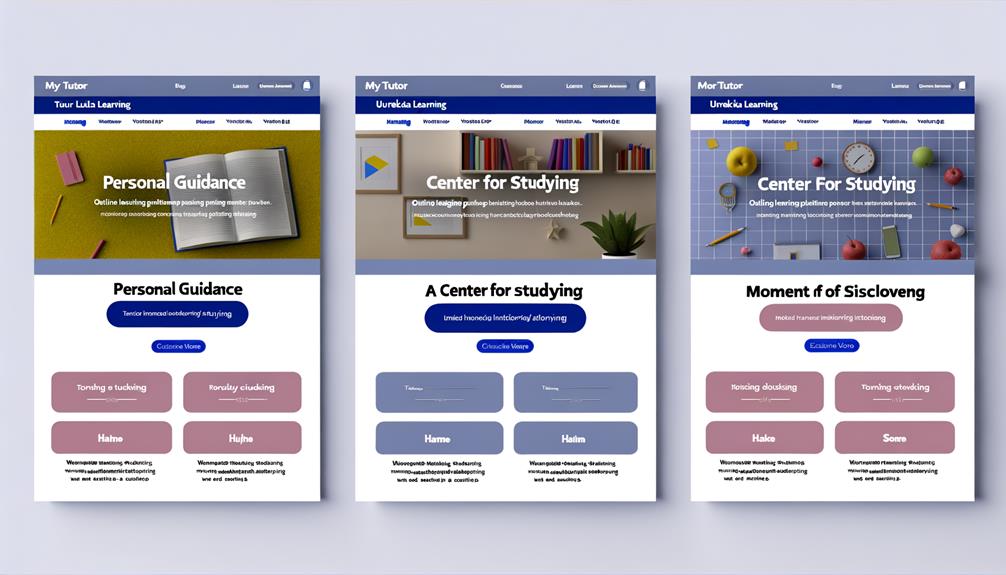
MyTutor, Tutor House, and Eureka Learning exemplify effective tutoring website designs, featuring easy-to-navigate layouts, engaging copywriting, and seamlessly integrated resources and testimonials.
These websites prioritize user experience, with soft color schemes, creative copywriting, and prominently displayed FAQs, free resources, and testimonials on their homepages. The sea green CTAs and extensive footers provide easy access to important pages, enhancing the overall user experience.
These designs are professional, yet liberating, catering to an audience that desires seamless navigation and engaging content. The clear messaging, vibrant images, and dynamic CTAs make these websites stand out as exemplary models for effective tutoring website designs.
In a competitive online landscape, these designs set the standard for professionalism and user-friendly interfaces, providing inspiration for others in the industry.
Learn to Be, Learnobots
The exemplary models of effective tutoring website designs set by MyTutor, Tutor House, and Eureka Learning pave the way for the discussion of 'Learn to Be, Learnobots', which showcases a philosophy of free education for all and engages visitors with actual student images in tutoring sessions and events.
- The hero image showcases the brand philosophy of free education for all
- Actual student images engaged in tutoring sessions and events
- Well-organized sequence of enticing offers, Why Us section, and testimonials
- Smooth flow and clear messaging across the website
The 'Learn to Be, Learnobots' website presents a compelling vision of inclusive education and a seamless user experience, making it an inspiring example for those seeking liberation through education.
VIPKid, Khan Academy
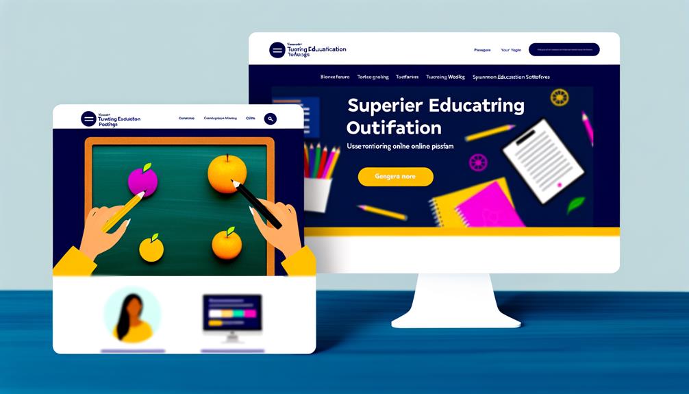
VIPKid and Khan Academy demonstrate professional website design with vibrant images against a clean backdrop. Their showcase of curriculum systems using rotating image platforms, brightly colored CTA buttons for free classes, and custom vector illustrations for each product exemplify their commitment to engaging design.
Well-designed search filter options further enhance user experience, allowing easy navigation through their offerings. Both websites prioritize clear communication and seamless navigation, catering to the needs of users seeking educational liberation.
With their visually appealing layouts and user-friendly interfaces, VIPKid and Khan Academy set a high standard for the industry, inspiring others to elevate their website designs for the benefit of students and educators alike.
TestMagic, Yola
TestMagic and Yola present vibrant website designs with eye-catching images and clear calls-to-action, maintaining the high standard set by VIPKid and Khan Academy for engaging and user-friendly interfaces. These websites stand out due to their:
- Fade-in images for featured products with prices
- Detailed descriptions and 'You may also like' section
- Brightly colored background and dynamic images
- Search feature in navigation menu on homepage
TestMagic and Yola's designs not only capture attention but also make it easy for users to find the information they need. With their visually appealing layouts and intuitive navigation, they set a benchmark for other tutoring websites to strive for.
36 by Design, OUTSCHOOL
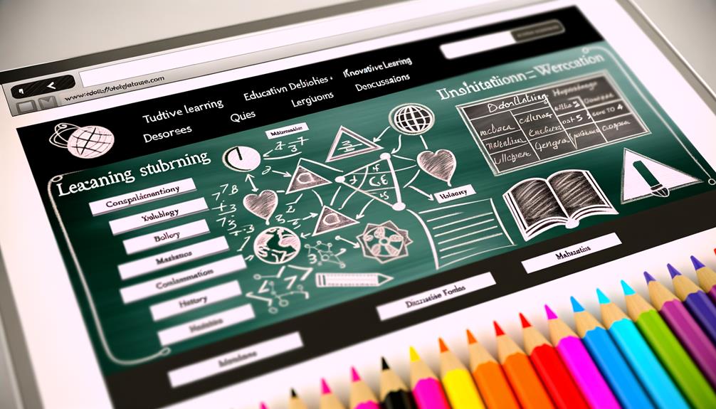
Striving for a sleek and minimalist design, by Design and OUTSCHOOL showcase inspiring website layouts that integrate educational elements seamlessly.
The striking branding image featuring educational words forming the number 36 immediately captures attention, while the main menu integrated into the hero image as you scroll down ensures easy navigation.
The bright green banner for upcoming event reminders adds a dynamic touch, and high-quality images of real students, classes, and events create an engaging experience.
The website's sleek and minimalist design, along with personalized photos, further enhances the overall aesthetic.
OUTSCHOOL's website stands as a prime example of how to effectively merge educational content with a visually appealing layout, offering valuable inspiration for those seeking to elevate their tutoring business websites.
STEM Tutoring Ottawa, TutorClass
STEM Tutoring Ottawa and TutorClass offer high-quality tutoring services in the field of science, technology, engineering, and mathematics, providing essential support for students seeking to excel in these areas.
- Engaging and informative slideshow with sharp, high-quality images
- Simple and clean background for easy navigation
- Essential information and contact options readily available on the homepage
- Dedicated pages providing detailed tutor information
These features demonstrate the commitment of STEM Tutoring Ottawa and TutorClass to deliver a seamless and informative experience for students and parents.
The website design reflects a focus on clarity, accessibility, and user-friendly navigation, ensuring that visitors can easily access the necessary information and resources.
Learning Lab
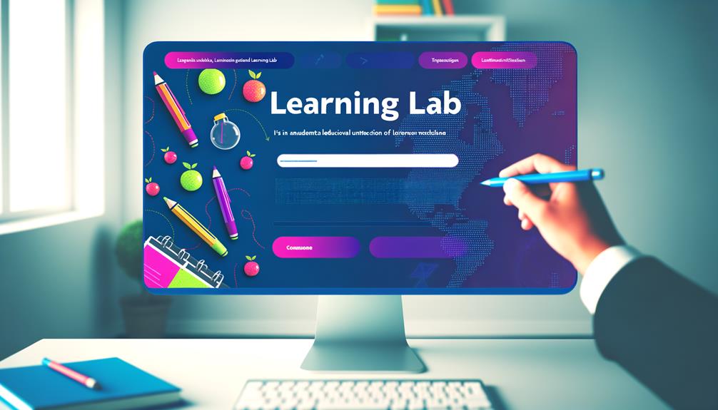
Learning Lab consistently employs vibrant colors and interactive buttons on their hero image to engage visitors and convey their dedication to providing an exceptional tutoring experience. The website's clean design and simple background make green CTAs stand out, while a handy contact form on the tutoring page facilitates easy communication. Moreover, Learning Lab scatters helpful resources like blog posts and articles throughout every page, ensuring that visitors have access to valuable information at every turn.
| Feature | Description |
|---|---|
| Vibrant Colors | Engages visitors and conveys dedication to exceptional tutoring experience |
| Interactive Buttons | Enhances engagement and user interaction |
| Green CTAs | Stand out against a simple background, guiding visitors to take action |
| Contact Form | Provides a convenient way for visitors to reach out for more information |
| Helpful Resources | Scattered throughout the website, offering valuable and informative content |
Learning Lab's approach prioritizes user experience and aims to liberate visitors by providing easy access to valuable resources and clear communication.
STEEZY
STEEZY's homepage features captivating side-by-side teacher-student dance videos, blending elegance with functionality in its dynamic web design.
- Engaging and dynamic web design
- Vibrant and diverse student videos
- Spot-on copywriting and comprehensive categories
- Use of vibrant colors to make their message pop
STEEZY's website embodies liberation and creativity, providing an immersive experience for students and instructors alike. The use of vibrant colors and engaging content fosters an environment that encourages freedom of expression and individuality.
The dynamic design and captivating videos showcase a commitment to breaking barriers and embracing diversity within the dance community. Whether you're a beginner or an experienced dancer, STEEZY's website design is a testament to their commitment to providing a platform that celebrates the art of dance while offering a seamless and user-friendly experience.
Design the Perfect Tutoring Business Website
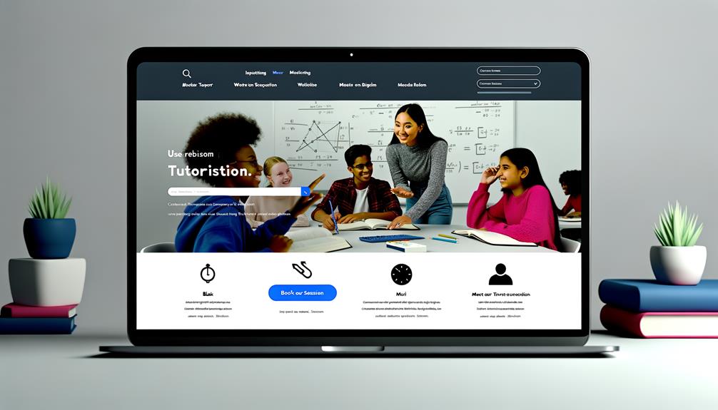
To design the perfect tutoring business website, it's essential to prioritize user experience and incorporate handy search filters to enhance navigation. A user-friendly interface and efficient search functionality are crucial for visitors to easily find the information they need.
Additionally, spritzing useful resources throughout the website can further enhance the user experience and provide valuable support to students and parents.
By implementing these strategies, your tutoring business website can elevate its online presence and attract more clients. This approach applies to all niches within the tutoring industry and can significantly contribute to the success of your business.
Incorporating these elements will ensure that your website stands out and effectively serves the needs of your target audience.
Website Design Examples
When considering exemplary tutoring business websites, it's beneficial to explore the design choices and features of Learning Lab and STEEZY.
- Learning Lab uses vibrant colors and interactive buttons on the hero image
- STEEZY's homepage features side-by-side teacher-student dance videos
- Learning Lab focuses on clear communication and helpful resources
- STEEZY excels in dynamic design and engaging content
These examples serve as inspiration for your own website design.
Don't Forget to Share This Post
Remember to share this post to spread the knowledge of great tutoring website designs and encourage collaboration within the tutoring industry.
Sharing this valuable resource allows others to benefit from the examples and insights provided, fostering a culture of learning and improvement within the tutoring community.
By sharing, you help others discover new ways to enhance their tutoring business websites and support the growth of the industry as a whole.
Together, we can elevate the standards and effectiveness of tutoring websites, creating a more enriching experience for both tutors and students.
Easy on the Eyes With Soft Color Schemes and Seamless Navigation
We appreciate website designs that incorporate soft color schemes and seamless navigation, as they contribute to a visually pleasing and easy-to-navigate user experience. When a website is easy on the eyes and effortless to navigate, it enhances the overall user satisfaction and engagement.
Here are some key elements we admire in tutoring website designs:
- Harmonious color palettes that soothe the eyes
- Intuitive menus and clear navigation paths for seamless browsing
- Thoughtfully placed CTAs that guide users without overwhelming them
- Consistent design elements that create a cohesive and polished look
These components not only enhance the aesthetic appeal but also ensure that users can easily find the information they need, ultimately improving their overall experience on the website.
Hero Image Showcases Brand Philosophy of Free Education for All

Incorporating a hero image that highlights the brand's philosophy of providing free education for all seamlessly complements the visually pleasing and easy-to-navigate design elements we admire in tutoring website designs.
The hero image serves as a powerful visual representation of the commitment to liberation through education. It communicates a message of inclusivity and accessibility, resonating with those who seek to break down barriers to learning.
This deliberate choice in design reflects a dedication to democratizing education and empowering learners from all walks of life. By prominently featuring this ethos, the website not only captures attention but also communicates a strong and compelling brand identity.
Such an approach aligns with the desires of an audience seeking to embrace and promote the principles of free education for all.
Professional Website Design With Vibrant Images Against Clean Backdrop
Professional tutoring websites achieve a polished aesthetic by incorporating vibrant images against a clean backdrop, captivating visitors with visually engaging content. This design approach creates a professional and vibrant atmosphere, enticing users to explore further.
Here's how this design element contributes to the overall appeal:
- Draws attention to key information
- Creates a visually stimulating experience
- Enhances the website's modern and dynamic feel
- Establishes a strong visual identity
These websites effectively leverage vibrant imagery against a clean backdrop to deliver a professional and visually appealing user experience, setting them apart in the competitive online tutoring space.
Vibrant Colors, Eye-Catching Images, and Clear CTAs
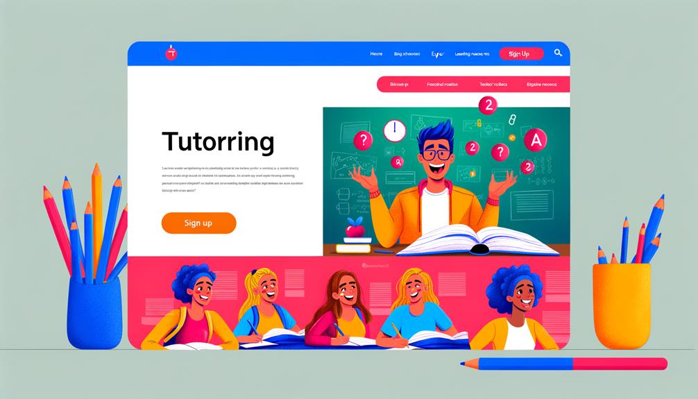
Utilizing vibrant colors, captivating images, and clear calls to action creates an engaging and visually compelling experience for website visitors. When these elements come together, they grab attention, convey information, and prompt action. Here's how leading tutoring websites are using these techniques effectively:
| Website | Use of Vibrant Colors | Eye-Catching Images | Clear CTAs |
|---|---|---|---|
| MyTutor | Soft color schemes | Creative copywriting | Sea green CTAs |
| VIPKid | Vibrant images | Rotating image platform | Brightly colored CTA |
| TestMagic | Vibrant colors | Fade-in images | Brightly colored CTAs |
These websites showcase the power of vibrant colors, captivating images, and clear CTAs in creating an immersive and impactful user experience.
Frequently Asked Questions
How Can I Effectively Incorporate a Hero Image That Showcases My Brand Philosophy of Free Education for All on My Tutoring Website?
We can effectively incorporate a hero image showcasing our brand philosophy of free education for all on our tutoring website by using a vibrant and captivating visual that conveys our message.
This image should feature real students engaged in learning activities, accompanied by concise and impactful copy that communicates our commitment to accessible education.
What Are Some Key Elements to Consider When Creating a Professional Website Design With Vibrant Images Against a Clean Backdrop for My Tutoring Business?
When creating a professional website design for a tutoring business, it's essential to prioritize user experience and incorporate vibrant images against a clean backdrop.
Implement handy search filters, sprinkle useful resources throughout the website, and focus on clear communication. These elements enhance engagement and set your business apart.
Elevate your tutoring website by applying these principles, catering to all niches in the tutoring industry.
How Can I Ensure That My Website Design Uses Vibrant Colors, Eye-Catching Images, and Clear CTAs to Effectively Engage My Audience?
We can ensure our website design engages our audience by using vibrant colors, eye-catching images, and clear CTAs.
Implementing these elements will create visual appeal and draw attention to important calls to action.
By incorporating these design features, we can effectively capture our audience's interest and encourage them to engage with our content.
This approach will elevate our website's visual appeal and enhance the overall user experience.
What Are Some Unique Ways to Personalize My Tutoring Website to Make It Stand Out From the Competition?
To personalize your tutoring website and stand out from the competition, we recommend prioritizing user experience. This will elevate your tutoring business and apply to all niches in the industry.
Incorporating handy search filters is also important. This feature will make it easier for users to find the specific type of tutoring they are looking for, improving their overall experience on your site.
Additionally, sprinkling useful resources throughout the site will provide added value to your users. This could include study guides, practice exercises, or helpful tips related to the subjects you offer tutoring for.
It's crucial to get started today and design a website that excels in dynamic design, engaging content, and clear communication. These unique elements will set your website apart and attract your target audience.
How Can I Utilize Fade-In Images for Featured Products With Prices to Attract and Engage Visitors to My Tutoring Website?
Fade-in images for featured products with prices can captivate and engage visitors to your tutoring website. By gradually revealing these images, you create a sense of anticipation and draw attention to your offerings. This subtle animation technique can enhance the user experience and make your products more visually appealing.
Utilizing fade-in images can effectively showcase your tutoring services and entice visitors to explore further.
Conclusion
In conclusion, the best tutoring website design examples we've explored have set a new standard for excellence in the industry. These platforms showcase a perfect blend of creativity and functionality, with seamless navigation, engaging visuals, and compelling calls to action.
As educators and entrepreneurs, we can draw inspiration from the standout features and innovative elements that have propelled these websites to the forefront of the tutoring industry. They truly exemplify the power of great design in enhancing the user experience.

