As enthusiasts of website design, we have uncovered a treasure trove of static website design examples that have left us in awe of their creativity and impact.
These examples not only showcase the power of visual storytelling and user experience but also provide invaluable inspiration for anyone looking to create their own standout online presence.
From sleek portfolio designs to imaginative interactive elements, these websites have set the bar high for effective design.
Join us as we uncover the secrets behind these 15 best static website design examples and learn how to craft your own compelling online space that stands out from the crowd.
Nathaniel Koloc
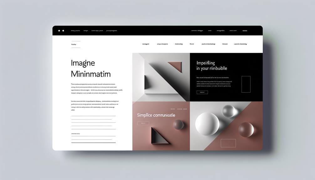
Nathaniel Koloc showcases his portfolio in a simple yet artistic way, making it a standout example of effective static website design. His website captivates with its clean layout, allowing his work to take center stage.
The intuitive navigation and fast loading times enhance the user experience, while the responsive design ensures seamless viewing on any device. The strategic use of animation adds a touch of interactivity, engaging visitors and guiding them through the site.
The color scheme sets a mood that aligns with his brand, evoking the right emotions. The typography and visuals are carefully chosen, creating a cohesive and visually appealing design.
Koloc's website exemplifies the importance of user experience and demonstrates the power of a well-crafted static website in leaving a lasting impression.
Gruev
Gruev's impressive portfolio design with a black-and-white color scheme and captivating elements makes it a compelling example of effective static website design, building on the principles showcased in Nathaniel Koloc's work.
Gruev's use of minimalistic design and striking visuals creates a sophisticated and timeless aesthetic that resonates with modern audiences. Here's why we love Gruev's website design:
- The black-and-white color scheme exudes elegance and simplicity, creating a sleek and professional look.
- It showcases a perfect balance between minimalism and impactful design, drawing the audience's attention to the content.
- The use of captivating elements and thoughtful placement of visuals enhances the overall user experience, making the website both engaging and memorable.
Gruev's design exemplifies the power of simplicity and strategic visual elements, setting a high standard for static website design.
COLLINS
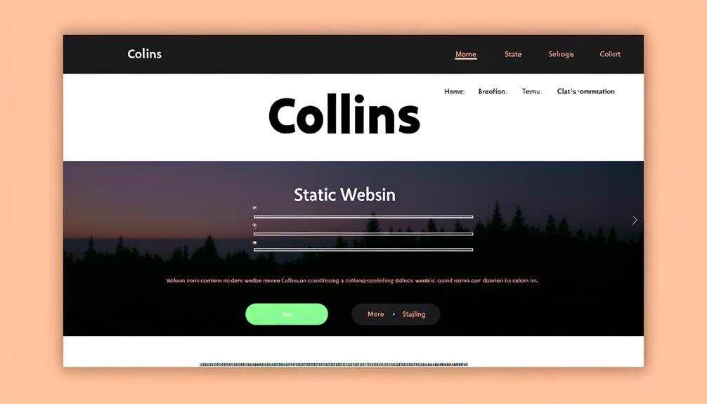
Impressively imaginative, COLLINS' website design incorporates interactive elements and artistic displays, setting a high standard for static website design.
The use of vibrant colors and dynamic animations immediately captures attention, creating a visually stimulating experience.
The seamless integration of interactive elements encourages user engagement, providing a sense of exploration and discovery.
The website's artistic displays showcase a deep understanding of visual storytelling, effectively conveying the brand's message.
COLLINS' design exemplifies the power of creativity in static website design, inspiring others to push the boundaries of traditional web design.
TwitchCon
TwitchCon's website features a simple yet engaging design that incorporates text, icons, and promotional videos to cater to gaming enthusiasts. The site's use of bold colors and dynamic visuals creates an immersive experience for visitors, while the intuitive navigation ensures easy access to event details and schedules.
An interactive map allows users to explore the convention layout and plan their visit effectively, enhancing the overall user experience. Additionally, the inclusion of live streaming and interactive chat features brings the excitement of the event to online audiences, fostering a sense of community and inclusivity.
The website's seamless integration of multimedia elements and user-friendly interface truly captures the spirit of TwitchCon, making it a must-visit for gaming enthusiasts.
Steven Mengin
Steven Mengin's standout portfolio impresses with its clever use of the GreenSock Animation Platform, capturing attention and enhancing user engagement. The seamless integration of animations and transitions elevates the overall user experience, making the website visually appealing and interactive.
Mengin's strategic use of animation guides visitors through the content and highlights essential elements, creating a memorable and engaging browsing experience. The dynamic nature of the website sets it apart, leaving a lasting impression on users.
This approach not only showcases technical prowess but also demonstrates a deep understanding of how animation can be leveraged to communicate effectively and create a strong visual identity. By incorporating such innovative design elements, Mengin sets a high standard for static website design, inspiring others to push the boundaries of creativity and user engagement.
Loops 3.0
Loops 3.0 captivates with its compelling design elements, showcasing responsive buttons and stunning 3D hero images that immediately draw visitors into a visually engaging browsing experience.
As we explore the dynamic features of Loops 3.0, we can't help but be impressed by:
- The seamless integration of interactive elements, creating an immersive user journey that encourages exploration
- Hover effects on images and buttons that add an extra layer of engagement
- Smooth transitions and animations that enhance the overall user experience
Loops 3.0 exemplifies the power of modern web design, offering a liberating and captivating experience for users. Its innovative approach sets a high standard for creating visually stunning and interactive static websites.
Hungry Book
After exploring the dynamic features of Loops 3.0, we're now drawn to the captivating website design of Hungry Book. With its elegant black and white theme, gliding headers, and minimalist layout, Hungry Book presents a sophisticated and modern aesthetic.
The use of subtle animations and transitions adds a touch of interactivity, enhancing the overall user experience. The website's clean design and intuitive navigation make it easy to explore the content seamlessly.
Hungry Book's emphasis on visual storytelling and seamless user interaction sets it apart, making it an inspiring example for those seeking to create a visually stunning and user-friendly static website. If you're looking to captivate your audience with a sleek and elegant design, Hungry Book's approach is definitely worth considering.
Banana Blossom Salads
Banana Blossom Salads showcases a fun and playful website design with engaging micro-interactions and captivating parallax scrolling. Our experience navigating the site was a journey through vibrant visuals and seamless transitions, making the visit truly enjoyable.
The playful animations and interactive elements kept us engaged and delighted as we explored the content. The smooth parallax scrolling effect added depth and dynamism to the storytelling, creating a visually immersive experience.
The website's design not only reflects the brand's lively personality but also sets a high standard for captivating and interactive digital experiences. With Banana Blossom Salads, we were inspired to rethink the possibilities of website design and the impact it can have on user engagement.
Alan Menken
Alan Menken's mesmerizing website showcases the artist's work through videos and an interactive menu, leaving a lasting impression on visitors. The website's captivating design and seamless navigation make it a standout example of effective static website design. Here's a glimpse of what makes Alan Menken's website so compelling:
| Features | Description |
|---|---|
| Interactive Menu | Engages visitors and provides easy access to content |
| Video Showcase | Showcases the artist's work in a visually stunning way |
| Seamless Navigation | Enhances user experience and encourages exploration |
Alan Menken's website not only captures the essence of the artist's work but also demonstrates the power of thoughtful design in creating an immersive online experience.
Gleec Chat
Gleec Chat presents a creative website with live background and pointillism-based creative images, showcasing innovative design techniques similar to Alan Menken's mesmerizing website. We found the following aspects of Gleec Chat's website design to be particularly impressive:
- Engaging Visuals
- The live background and pointillism-based creative images create a visually captivating experience.
- The use of visuals effectively conveys the brand's creativity and innovation.
This unique approach to website design not only captures attention but also sets a high standard for creativity in the digital space. Gleec Chat's website serves as a testament to the power of innovative design in captivating and engaging users.
Jack Fielding
We found Jack Fielding's sleek and practical portfolio design to be a standout example of effective website design, featuring high-quality image slideshow and intuitive navigation.
The use of high-resolution images and seamless transitions creates a visually compelling experience for visitors.
The straightforward layout and easy-to-use interface make it effortless for users to navigate and explore the showcased work.
This kind of design not only captures attention but also ensures that the focus remains on the content.
The simplicity and elegance of Jack Fielding's website demonstrate how a minimalist approach can still deliver a powerful impact.
Studio MPLS
Studio MPLS presents an impressive packaging company website with scroll-triggered screen reveal, showcasing their innovative and captivating design work. This website demonstrates the power of visual storytelling and user engagement, making it a standout example in the static website design landscape.
When exploring Studio MPLS's website, we appreciate the following features:
- Engaging Visual Storytelling
- Scroll-triggered screen reveal captures attention
- Innovative design work creates a captivating user experience
Studio MPLS's website serves as a testament to the impact of compelling design in capturing audience attention and conveying brand identity. This example inspires us to leverage creativity and innovation in our own static website designs, aiming for a user experience that's both engaging and memorable.
MBC Creative
After exploring Studio MPLS's impressive packaging company website, we're now shifting our focus to MBC Creative, a visually stunning website with interactive elements and smooth transitions.
MBC Creative's website captivates visitors with its seamless navigation and engaging design. The use of interactive elements adds a dynamic dimension to the user experience, drawing us in and encouraging exploration.
The smooth transitions between sections create a sense of continuity and flow, enhancing the overall browsing experience. MBC Creative's website serves as a prime example of how static websites can be transformed into immersive and visually appealing platforms.
Its innovative approach to design and interactivity sets a high standard for static website development, inspiring creativity and pushing the boundaries of what's possible in web design.
Majestyk
Majestyk's website exemplifies creative design with its unique layouts and vibrant colors, setting a high standard for visually engaging online platforms.
When browsing through Majestyk's website, we can't help but notice the following key elements that contribute to its appeal:
- Engaging Visuals
- The use of stunning imagery and dynamic graphics immediately captures attention
- Vibrant colors and bold typography create a lively and immersive experience
This approach not only showcases their creative prowess but also demonstrates the power of captivating design in leaving a lasting impression.
If you're aiming to create a website that stands out and resonates with your audience, taking inspiration from Majestyk's design choices could be a step in the right direction.
Jay Pharoah
Jay Pharoah's dynamic portfolio website showcases interactive elements and engaging visuals, setting a new standard for creative design in the industry.
The website captivates visitors with its seamless navigation and innovative use of animations.
Pharoah's bold choice of color schemes and typography reflects his vibrant personality, creating an immersive experience for users.
The inclusion of high-quality visuals and dynamic content ensures that every visit is a visual delight.
The website's responsiveness across various devices demonstrates a commitment to inclusivity and accessibility.
Pharoah's strategic use of microinteractions and engaging multimedia content elevates the overall user experience.
Frequently Asked Questions
What Are the Key Factors to Consider When Choosing a Color Palette for a Static Website Design?
When choosing a color palette for a static website design, it's crucial to consider the overall mood and tone that align with the brand. Different colors evoke specific emotions and associations, so we aim for consistency and readability.
Contrast is key for visual impact, and we prioritize color psychology to influence user behavior positively. Our goal is to create a cohesive design that enhances user experience and leaves a lasting impression.
How Can Animation Be Used Strategically to Enhance User Experience on a Static Website?
Animation strategically enhances user experience on a static website by adding visual interest and guiding users through content. Engaging animations can convey information, highlight important elements, and improve overall design quality.
When used thoughtfully, animations create a more interactive and enjoyable browsing experience, ultimately increasing user engagement. By implementing animation, a website can effectively capture and maintain user attention, leading to a more immersive and impactful online interaction.
What Are Some Examples of Effective Typography Choices for Static Website Design?
Effective typography choices for static website design include:
- Clean and readable fonts that align with the brand and content.
- Consistent typography to create a cohesive design.
- Hierarchy and spacing to enhance legibility and visual hierarchy.
Accessibility considerations ensure:
- Readability for all users.
- Promoting inclusivity and usability.
When used strategically, typography can greatly impact:
- The overall user experience.
- Leaving a lasting impression on visitors.
How Can the Use of Visuals Be Optimized to Improve Loading Times and User Experience on a Static Website?
To optimize visuals for a static website, we use high-quality images and graphics, while optimizing them for faster loading times.
Proper use of whitespace and visual hierarchy creates a balanced layout for improved user experience.
By optimizing visuals, we ensure quick conveyance of information and enhanced overall design.
This approach leads to higher engagement and satisfaction among users, contributing to a positive website experience.
What Are the Current Trends in Responsive Design for Static Websites?
In responsive design for static websites, the current trends include:
- Minimalistic layouts with clean lines and ample whitespace for a balanced visual experience.
- Bold and vibrant colors are being used to make a strong visual impact.
- Custom illustrations and subtle animations contribute to unique branding.
- Microinteractions and integration of video and interactive elements enhance the overall user experience.
- Making the website engaging and visually appealing across devices.
Conclusion
In conclusion, static website design offers endless opportunities for creativity and impact. By incorporating key elements such as animation, color, typography, visuals, and user experience considerations, you can create a standout online presence that captivates and engages.
The examples we've explored showcase the power of visual storytelling and innovative design, inspiring us to bring our own unique ideas to life. With the right tools and knowledge, anyone can create a compelling static website that leaves a lasting impression.

![15 Best Static Website Design Examples We Love [ How To Make Your Own]](https://www.honestwebs.com/wp-content/uploads/2023/12/static_website_design_inspiration.jpg)
